
Better Help Rebrand
redefining online therapy and support
Assignment
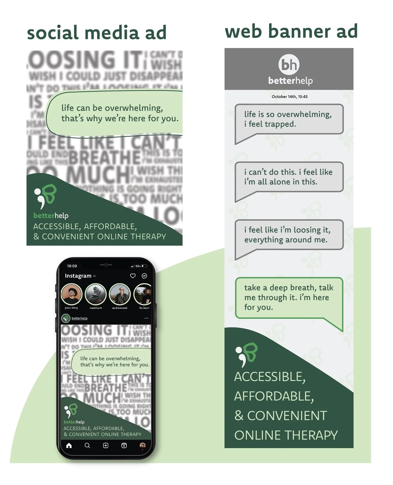
To redesign BetterHelp’s brand identity, through a new logo, a mobile website, and social media advertisements.
Know-how
Adobe Illustrator, Adobe Photoshop, and Adobe XD
Plan
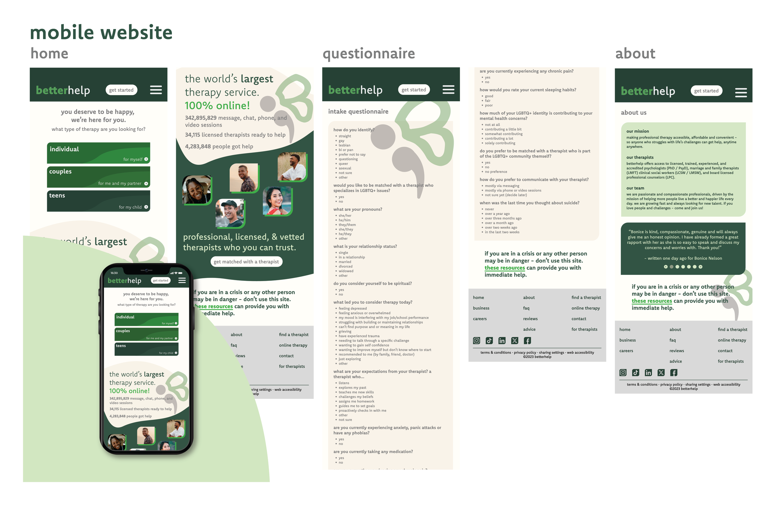
The plan for this project was to rebrand BetterHelp. The redesign aimed to make the site more user friendly and easier on the eyes.
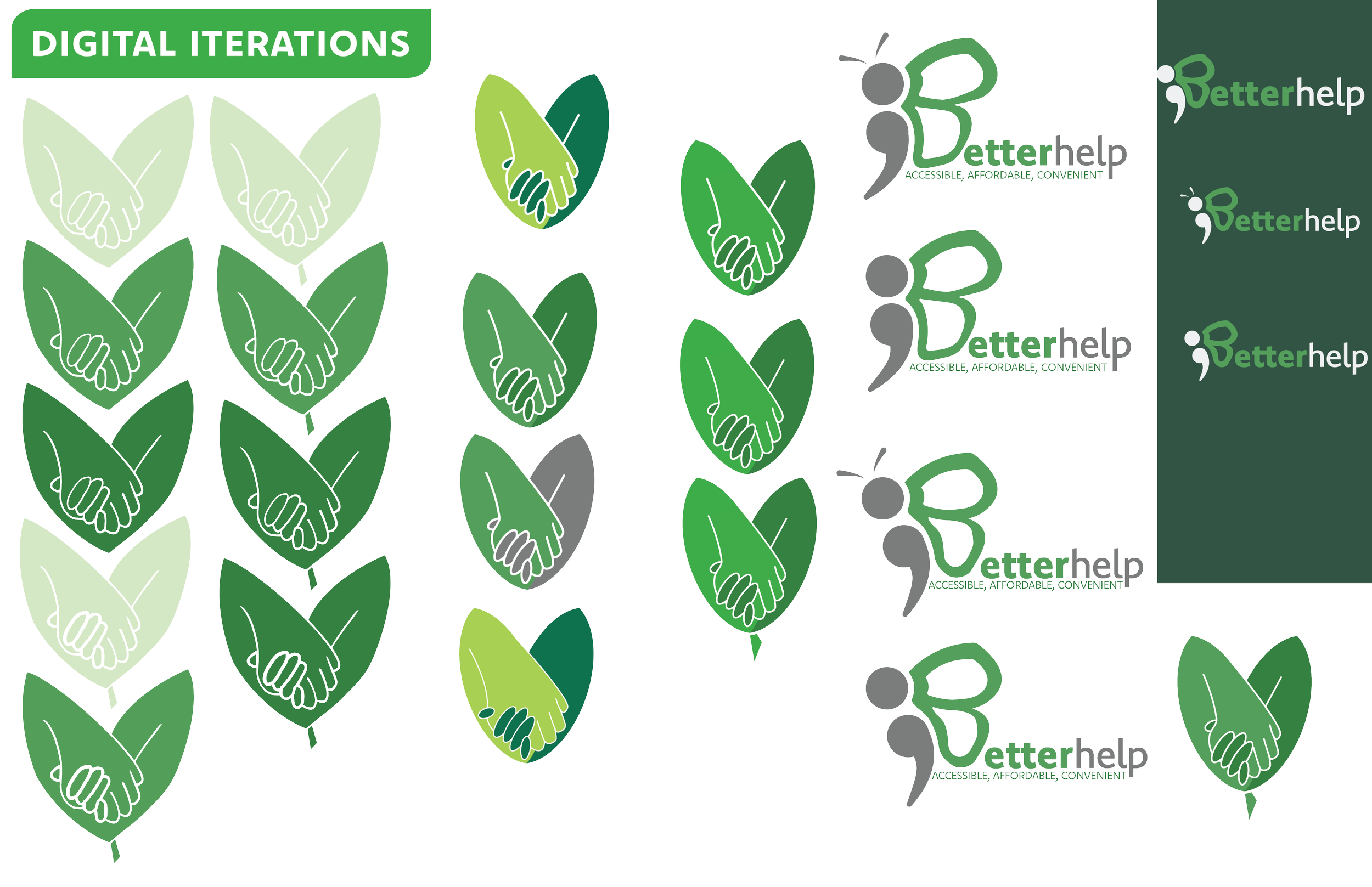
Like most projects, I began by researching the brand and any competitors the brand may have.
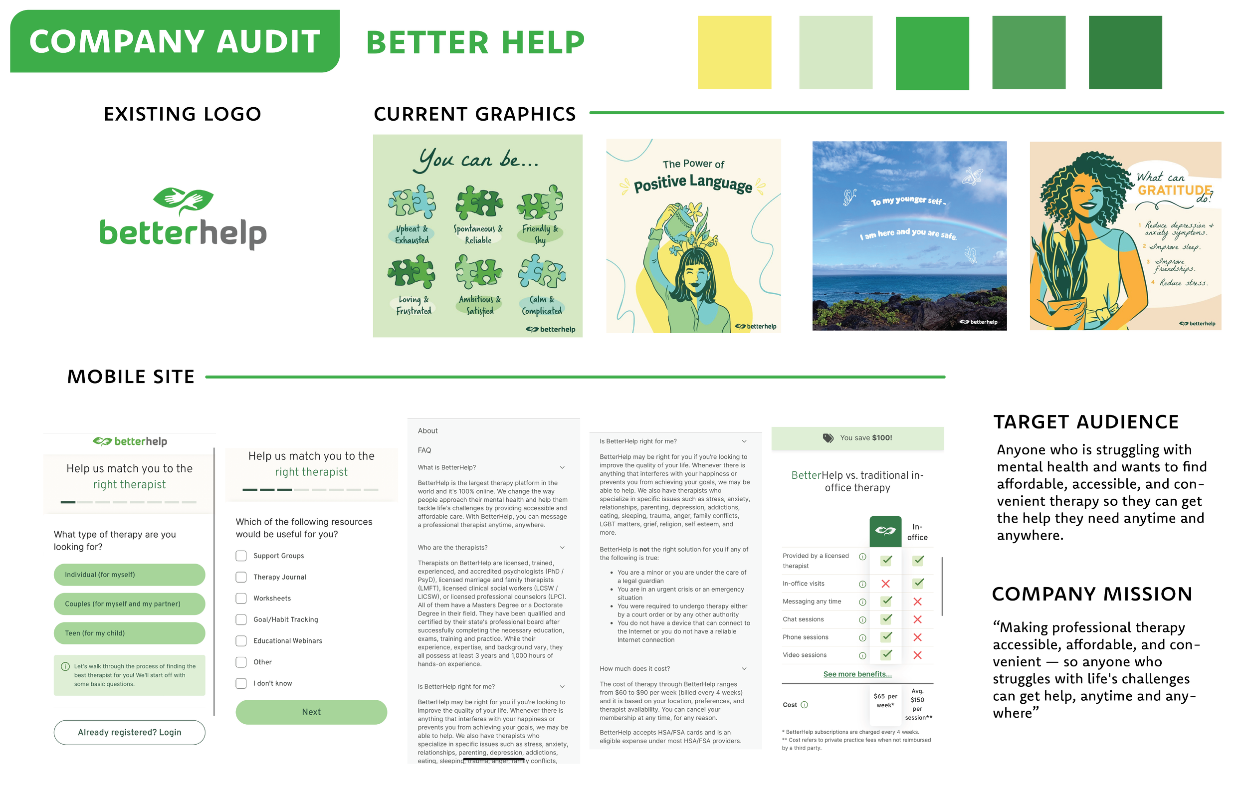
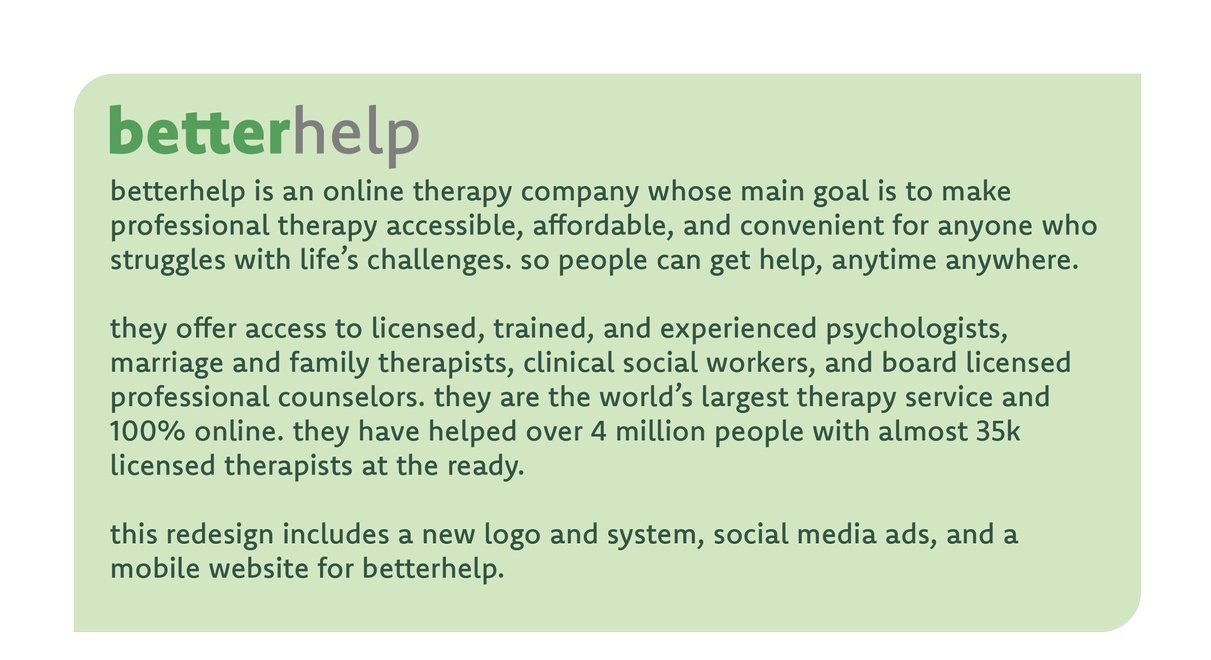
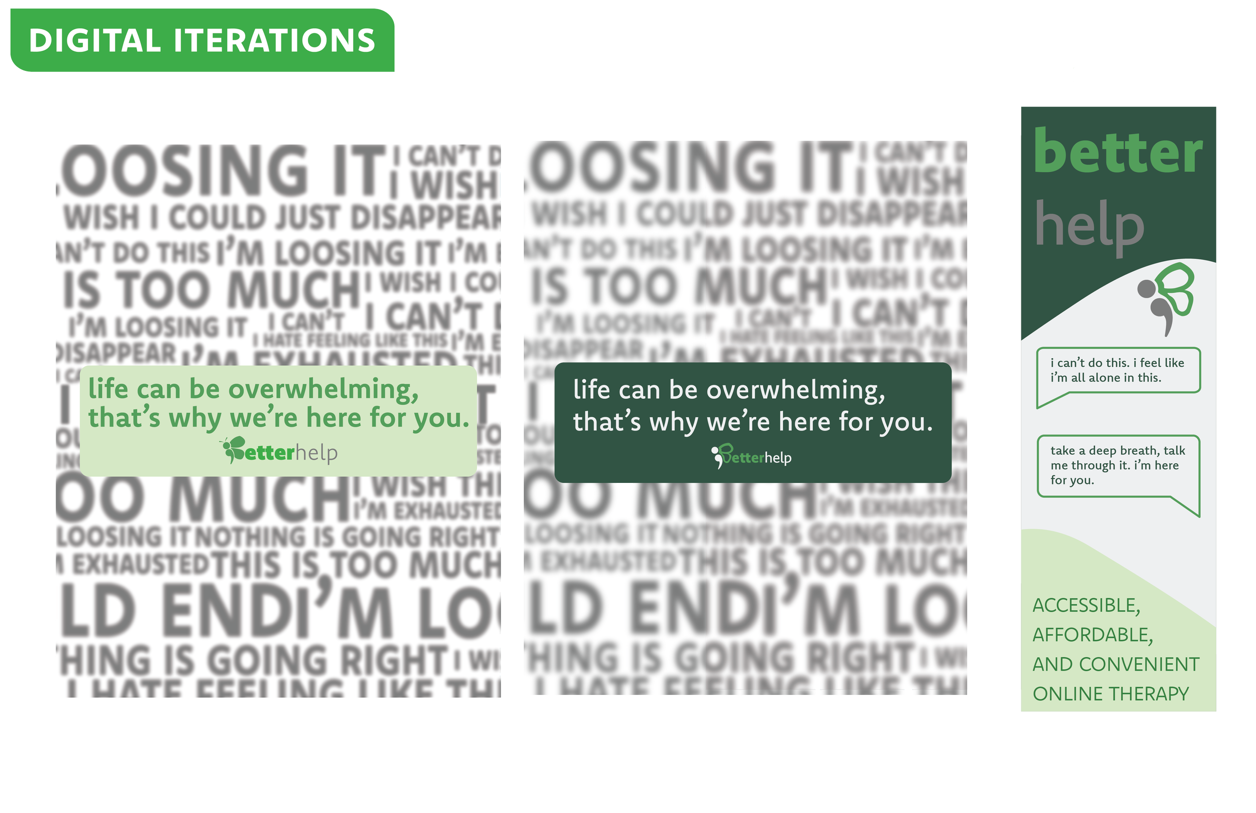
BetterHelp’s current logo is of hands within leaves of a plant and their current color scheme is greens with a hint of yellow. Their current graphics are in a hand drawn sketch style really only consisting of the colors in the palette. Their current mobile site is very text heavy with little to no graphics. Their target audience is anyone who is struggling with mental health and wants to find a more affordable, accessible, and convenient therapy so they can get the help they need anytime and anywhere. Their mission statement is all about making professional therapy accessible, affordable, and convenient.
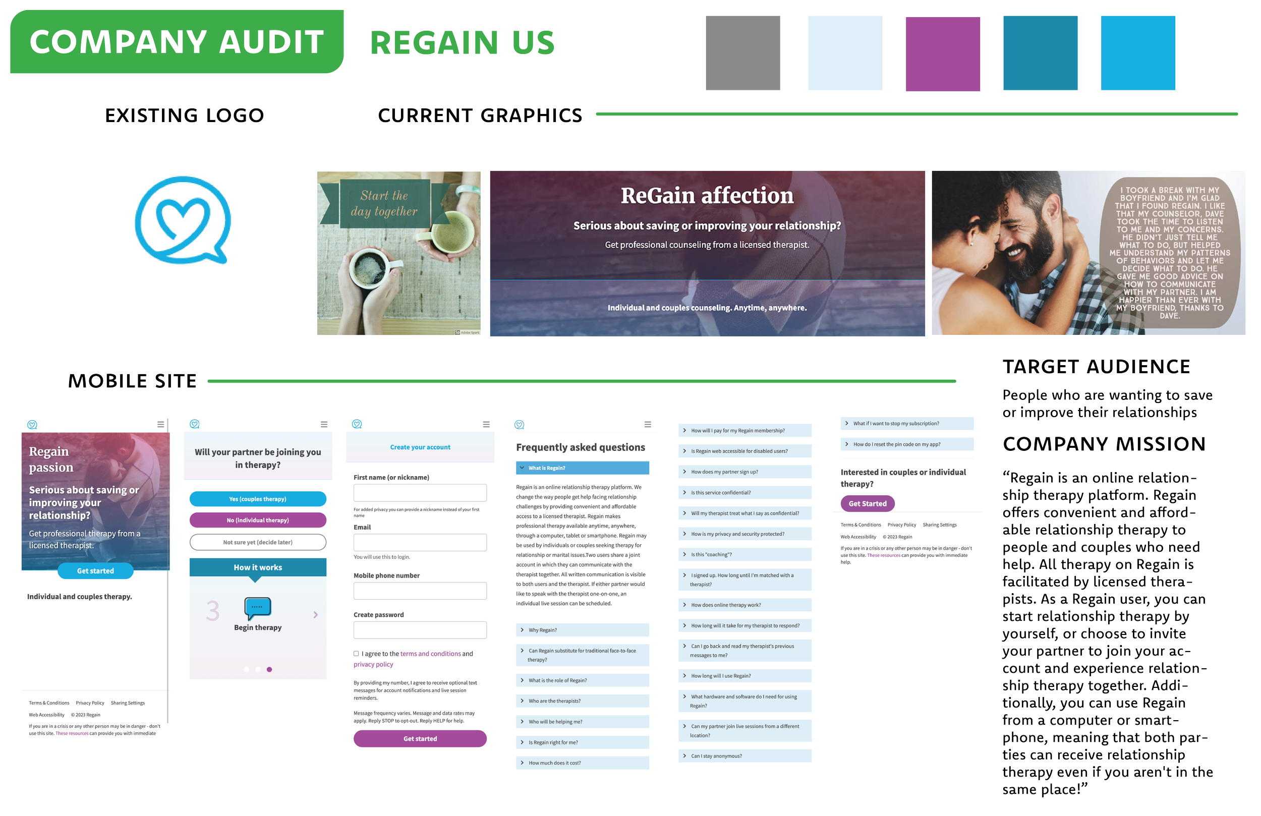
Their main competitor is a company called Regain Us. Their current logo is a heart within a message bubble icon with a blue and purple color palette. Their current graphics are more photography heavy while keeping with their colors. Their mobile site is still very text heavy but introduces their colors more. Their target audience is people who are wanting to save or improve their relationships. It seems to be aimed more towards people trying to utilize therapy to improve relationships in their lives over general mental health concerns but is not limited to that. Their mission statement is about it being online with convenience and affordability.
Results
The BetterHelp rebrand was done.
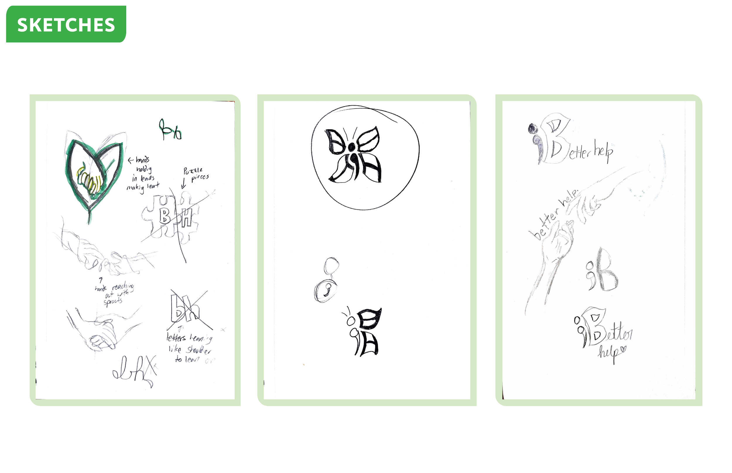
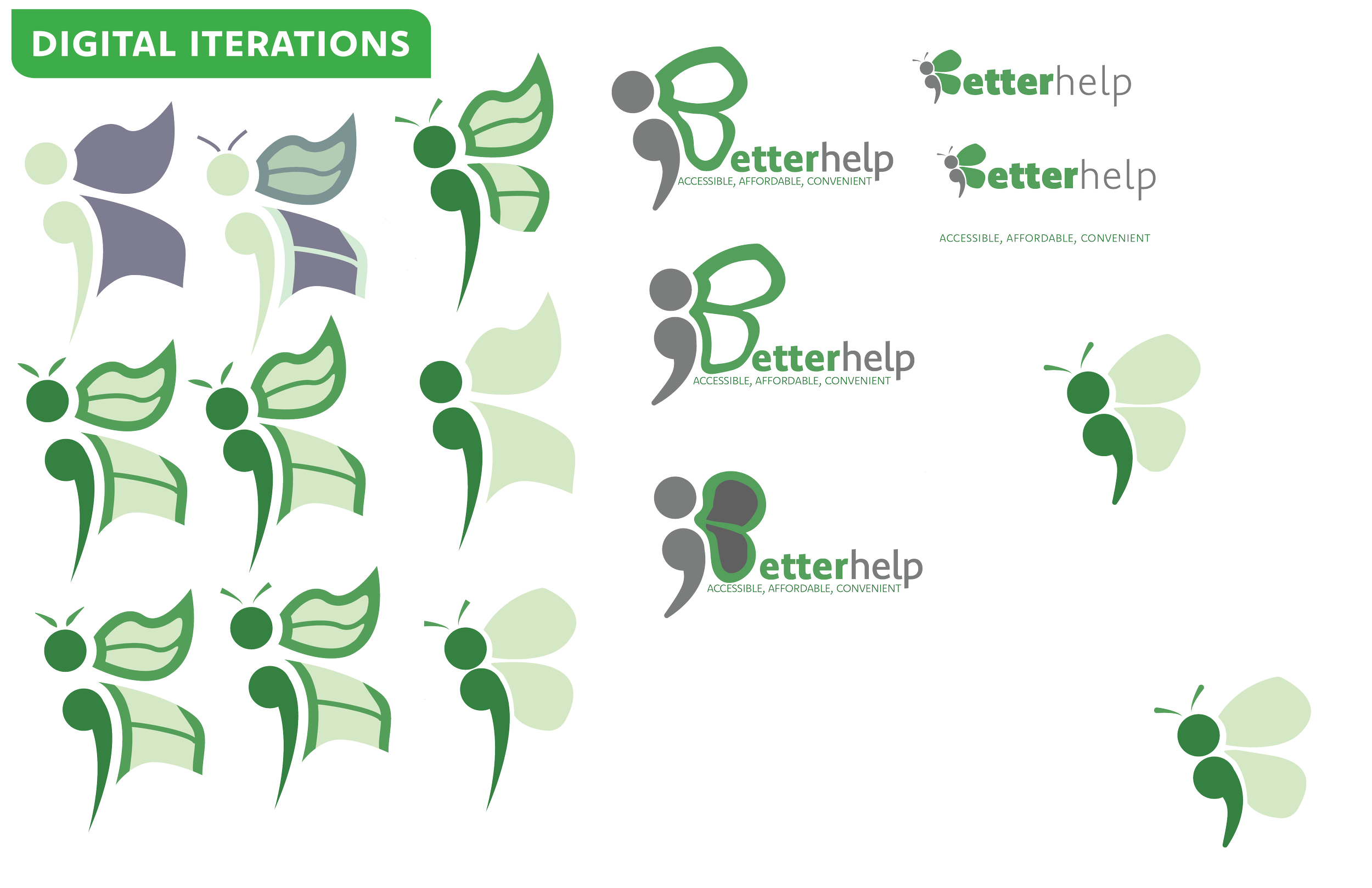
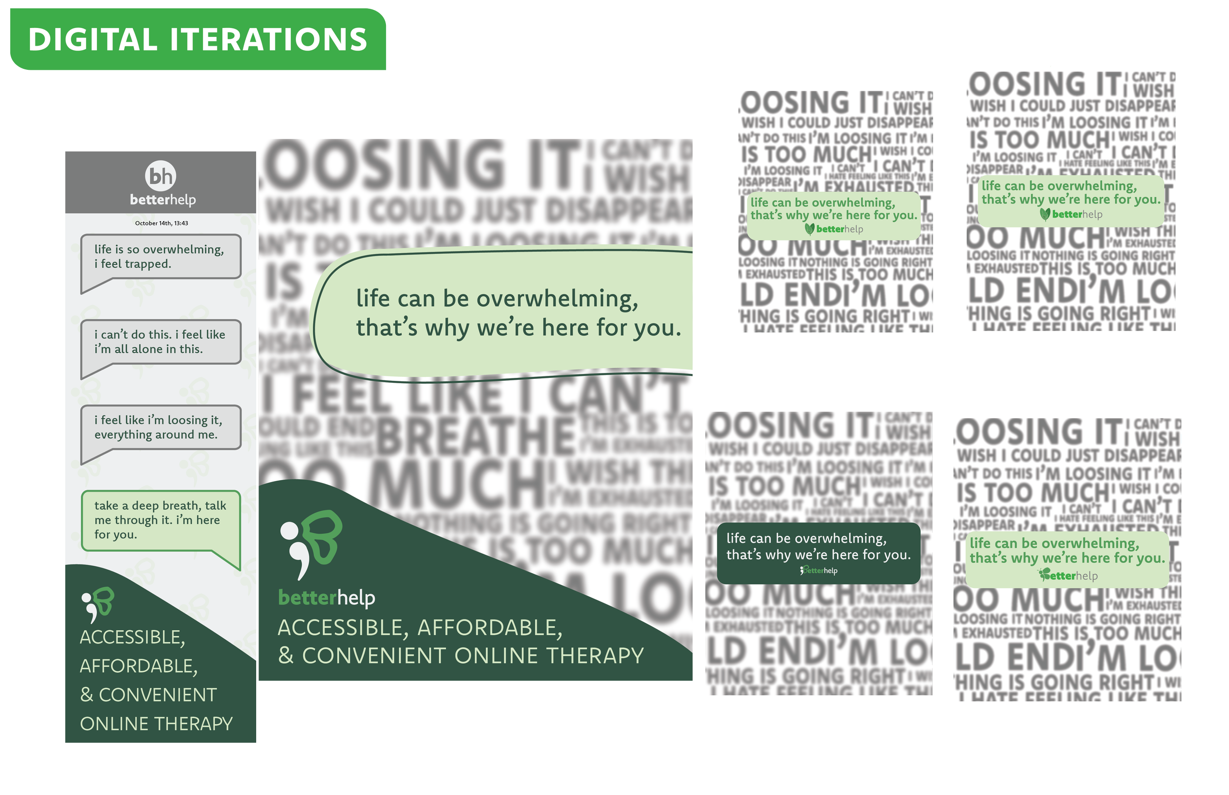
Process
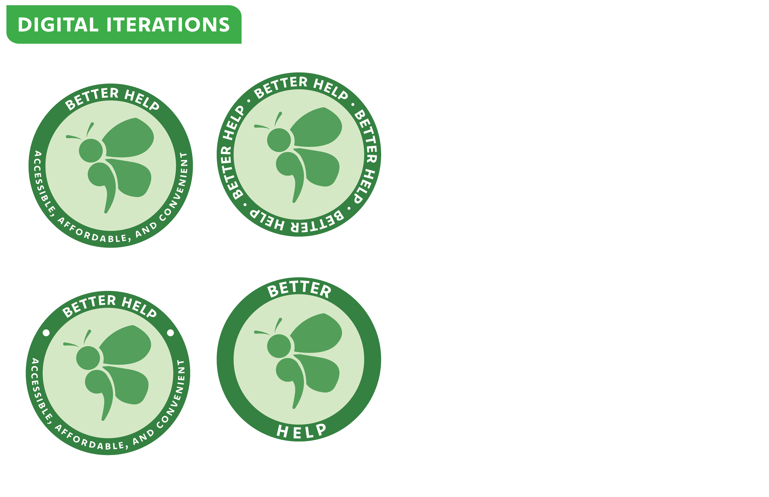
Here is my process of how I came up with the final product.
Approach