


Craft Blade Company
affordable precision cutting blades
Assignment
To create and design a one-page long-scrolling website for a fictitious company, The Craft Blade Company. The project began by selecting and purchasing a single item from the dollar store to serve as the product focus for the website.
Know-how
Adobe Illustrator, Adobe Photoshop, basic HTML and CSS
Plan
When being told I had to purchase a single item from the dollar store, I had no idea what I wanted. I just wanted it to be something I knew that could work. Meaning, something I know and not a completely random object.
I began this assignment by going to the nearest dollar store and searching for an item that could work with all the requirements. After searching for a while I finally decided on a what the store marketed as a “craft blade,” which was basically a non branded Xacto knife.
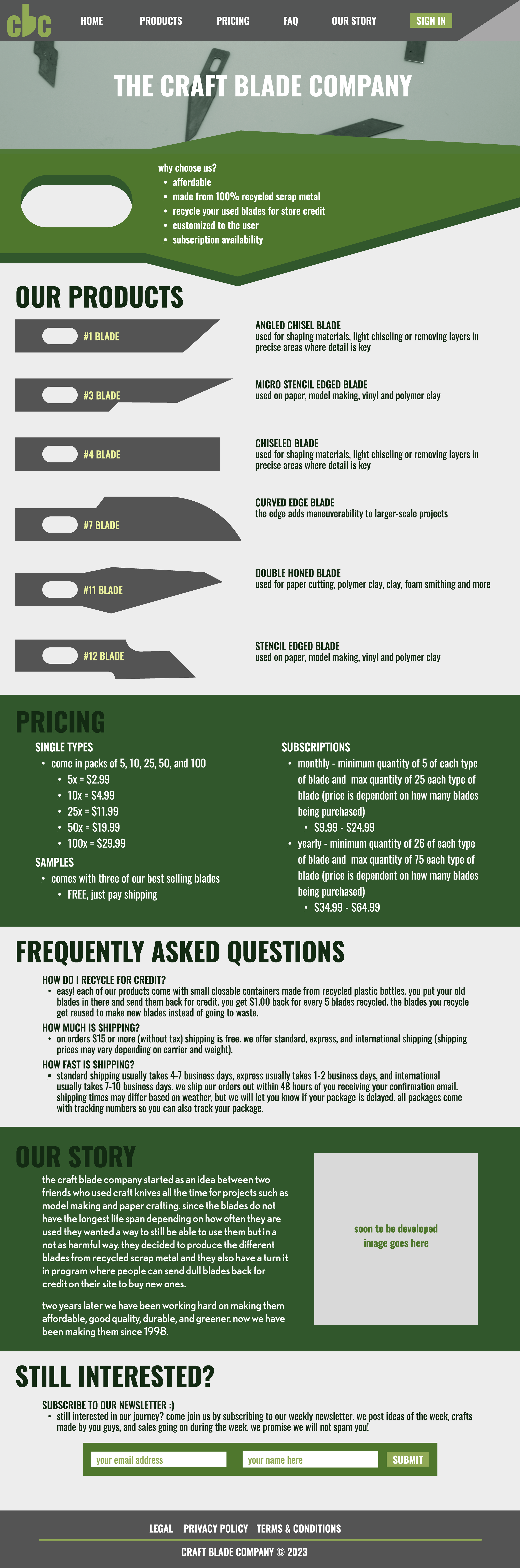
Depicted is my first round of wireframes, they are hi-fi because I had so many requirements for the different sections. My main goal here was to be able to separate the sections, but still make it readable and digestible.
Requirements on this project were that the page must include a benefits/features section, product section, prices, frequently asked questions, an about section and a sign up section.
There was much research done to determine what kind of blades were used for what kind of cutting and materials. Each blade served a different purpose. I chose six different ones as they were the six that came in the craft blade pack from the dollar store.
Pricing for this project was all made up, but it was based on the amount of replacement blades and not the actual handle that holds the blade.
The FAQ section served as a general questions area. Specifically for this site there was a recycling program to get credit back because the main point of this product was that it was better for the environment and more sustainable since the blades were made of scrap metal. The other two questions are general shipping questions about cost and time.
This is the about section, more specifically the story of how the company came to be. As someone who indulges in writing every now and again it is always fun making up a little backstory for a company.
This is the last section of the page, a call to action of our choice. The user would just fill out the fields and proceed to press submit.
Approach
Results
The creatively named “Craft Blade Company” was coded and executed as a static website.

Hi-Fi Wireframes
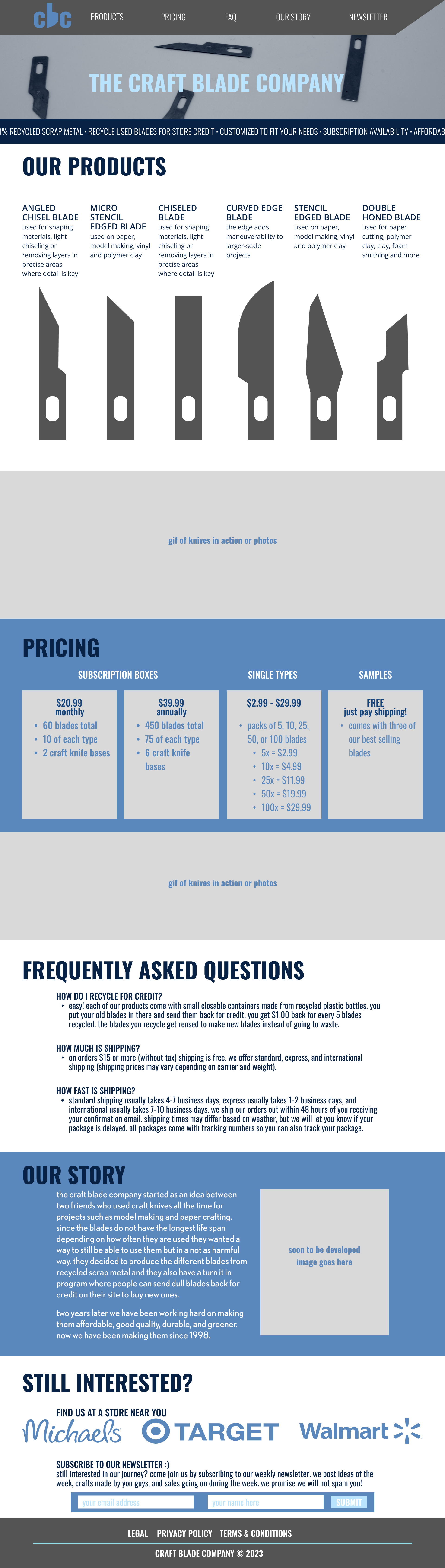
Depicted is my second round of wireframes after feedback from my professor and peers.
For starters, I was told to go with a different color as I used green in many of my projects. So I changed the color palette to blue instead. The next change was the benefits/features section, at the time overlaying a shape like that with text in it was a little out of my skill range considering the time I had left for the project. Instead I decided to compromise and still have the benefits/features there but I decided to make it a moving banner that moved from right to left at the top. It would draw attention because of the movement.
For the products section, I was not personally sold on the layout so I tried some more and ended up with this vertical layout.
To help separate the chunks of text I decided to incorporate images and videos.
Instead of just text with hierarchy, I was suggested to use some sort of blocking with tiers so make it clearer for pricing.
Not much changed in the frequently asked questions section, just spaced out the three questions more to make it easier to read.
Not much changed in the about section either, just more contrast with colors and spacing.
For the call to action section I decided to keep the bulk of it but add a section for stores where the customer could buy the product in person instead of online only.
Hi-Fi Wireframes After Feedback
Depicted is the final website I produced. Some minor changes were made but overall it is quite close to the wireframes and the idea I wanted to make.
Although the image is still, this text does move on the site when downloaded and opened.
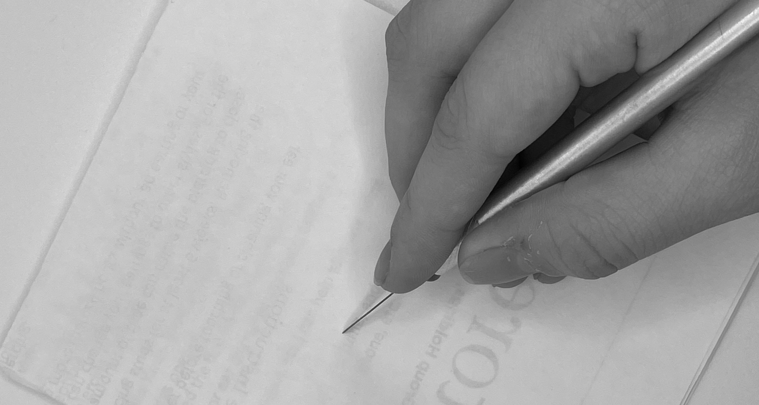
On the site this is a live looped video of the blade slowly spinning on a product spinner to make it look fancy. It was my first time adding a video to a website.
Note, since this image on the left is part of the background in the code, when a full area screenshot is taken the image does not show up so I had to add it back in to show it. It shows up as a blank space.
The only difference here is this section had changed to columns instead of rows to make it easier to read.
I had the opportunity to grab a free image from the web, but I thought it would be more fun to draw stick figures of the founders. It gave the site a little life to it and I got many positive comments about how people thought adding that was funny.
The call to action section did not change much, just more spacing and all one color instead of the stores being colored.